Stampin' with Karen
  • Blog
  • Store

#PLxSU:  A Winning Combination!

4/30/2014

0 Comments

 
Picture
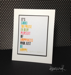
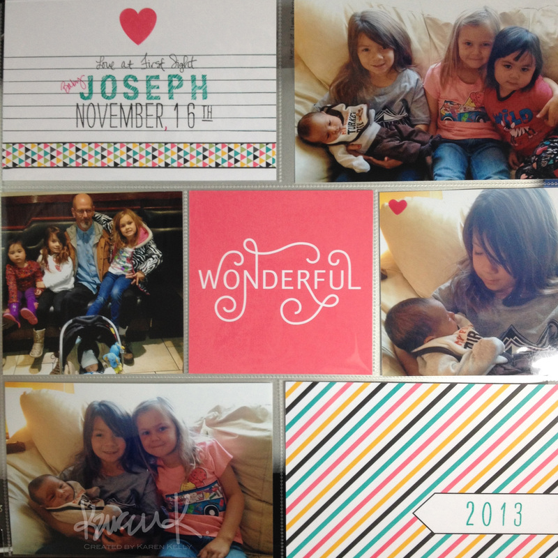
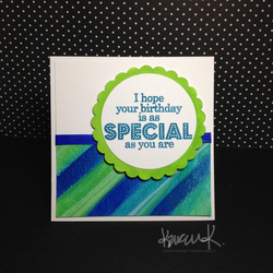
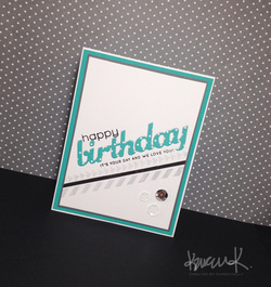
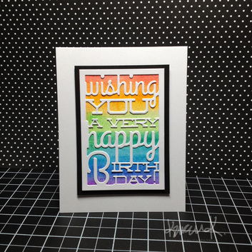
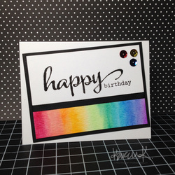
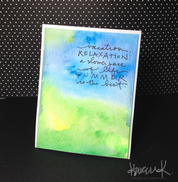
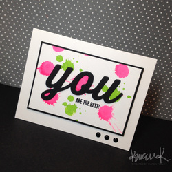
I am a huge fan of Becky Higgins so the fact that she and Stampin' Up! have joined together to offer exclusive Project Life products is one of the most exciting things to happen in my career as a SU! demo.  Add to that the fact that SU! seems to have embraced photopolymer stamps and I am ONE HAPPY CAMPER and really looking forward to seeing the new catalog!  I don't typically preorder products available to demos, but with the free shipping offer last week, I couldn't pass up the chance to be one of the first to get my hands on the new Project Life products that Stampin' Up! has to offer.  I have to say, I LOVE the new products--every package I opened just made my happy :-)  I made this card in about a minute flat just by mounting one of the 3x4 cards onto a piece of black cardstock and then popping that up on a white card base.  I loved the quote and thought the card by itself would be such a great card for someone in my #teambehappy crew at some point.  I then threw together a quick scrapbook layout which you can see below using some more of the cards from the Everyday Adventure set that will be available to Stampin' Up! customers tomorrow, May 1st.  Probably the most time-consuming part of this entire layout was the title card--I used a ruler and one of the journaling pens to make the lines black (they were originally blue) and then stamping Joseph's name probably took the longest amount of time--I did line the stamps up and then ink and stamp them all at once which I thought would save time but it probably took me longer than just stamping them one at a time haha!  I am LOVING the photopolymer stamps--Stampin' Up! is known for their quality and it's 'clear' they went with a high grade photopolymer.  I am so excited about the direction Stampin' Up! is moving in--it is renewing my energy as a demo!

Here is a link to the Stampin' Up! blog that shows the products that will be available tomorrow--even more will be included in the new catalog!  I like the variety of page protectors--the unique layouts are something that I hope Stampin' Up! will consider expanding on as it develops products.  With the standard protectors being available at local 'big box' stores with coupons, I think it will be difficult for SU! demos to sell those.  I will be having an open house a little closer to new catalog release and cannot wait to share all of this fabulousness with all of you!

Picture
I will be adding product links once they're available :-)
0 Comments

I Like you a Watt

4/27/2014

4 Comments

 
Picture
I typically shy away from 'punny' stamp sets but when I saw this one, I knew I had to get it so that I could make cards for a couple of students I enjoy so much whose last name is 'Watts'.  I kept it pretty simple and stamped the lightbulb image onto a sheet of Tim Holtz Distress Watercolor paper which I had watercolored in shades of yellow.  I thought the slight variations in color would help bring the lightbulb to life :-)  I cut the image out and popped it onto the card front using some Stampin' Up! dimensionals and then stamped the sentiment using Versafine Onyx Black underneath the image.  I liked the clean and simple design so I scratched the enamel dots I was thinking of adding in the bottom right-hand corner.  I made two of them in a matter of minutes (not including the drying time for the watercolored paper).  The girls should have gotten these in the mail yesterday--hope they liked them!

Think I will submit this for Simon's Wednesday Challenge even though I didn't use any Hero Arts products--definitely kept it clean and simple though!

4 Comments

Square Cards

4/27/2014

2 Comments

 
Picture
I wanted to make another card for the Simon Wednesday Challenge and ended up with two. I started by watercoloring a background panel using a variety of blues and greens and because the panel ended up being a little strong, I cut it up and used it in a couple of different ways. On this card, I used it as an accent behind the sentiment which I stamped using SU!'s Pacific Point--not quite as blue as I wanted (really missing Brilliant Blue right about now), but it was a close enough match that I kept it.  I colored a white piece of cardstock using a Hero Arts ink dauber to get a green that would match the painted panel.  I added a little grosgrain ribbon which was originally white--painted it using the watercolors to match the card.  The stamp set I used is Many Birthday Messages from Hero Arts.

Picture
This Father's Day card came together very quickly as all I did was heat emboss the stamped image in white.  Love the new Mother's and Father's day sets designed by Kristina Werner over at Simon Says Stamp!  I painted the edge of a white panel using a bright blue paint to mount behind the painted stripes and then mounted those together using some Tombow Mono Adhesive.  I was worried the paper might start to curl in the corner so I used my Tim Holtz mini staple gun for the first time and I think I love that thing!  Such a cute little accent!

I think I will hold off on posting product links while SSS is updating their inventory in InLinkz since the majority of my supplies used are from there :-)

2 Comments

Watercolor Thanks

4/27/2014

1 Comment

 
Picture
Wanted to make a card for a woman who works at our district's main office as she has been so helpful to me throughout the years and in the past couple weeks in particular.  I had some leftover watercolored paper from some yellow lightbulbs I made for another card (will have that posted soon, I hope!) and decided to make a separate panel incorporating some purple to represent our school colors.  I heat embossed the 'thanks' in white and then added the stamped sentiment underneath in black.  I had to modify the sentiment slightly so that it would fit and it ended up making 'for everything' look like one long word, but I think it will be okay...I guess I'm hoping she won't notice :-)


Distress Watercolor Cardstock
PTI Wet Paint
SSS Sakura Koi Watercolors Sketch Box (24)
White Stampin' Emboss Powder 109132
Snail Adhesive 104332
Whisper White Craft Stampin' Pad 101731
VersaFine, Onyx Black
InLinkz.com
1 Comment

More Neon Splats

4/25/2014

3 Comments

 
Picture
Since I had so much fun smashing my new Hero Arts ink daubers last week for a card, I decided to do it again for Simon's Wednesday Challenge: Keep it Clean & Simple. Perfect products to use as they are featuring Hero Arts this week!  I bought a neon blue ink dauber which I tried using but I just couldn't get the ink to 'splat' when I slammed the dauber onto the paper--the ink just kinda stayed where it was and the color wasn't all that vibrant so I scratched it and went back to the trusty pink and green combo.  I added some black ink spots using Versafine and a stamp from Stampin' Up!'s Gorgeous Grunge--perfect for trying to add a little more 'mess' in a controlled way.  I got some mini neon ink cubes and I'm loving how bright and colorful the colors are.  I broke down and ordered the full-sized neon pads as well from Ellen Hutson's online shop and then saw today that Hobby Lobby carries them as well.  A 50% ink sale would be a great time to pick those ink pads up if you are interested!  Wish I would have realized sooner that they carried them but I got a decent price on them so I'm not too disappointed.  

With the overhaul of Simon Says Stamp!'s website, there are some issues with links working via InLinkz so here are links to the two Hero Arts sets I used for this card:
Yay!
Borders and Arrows

Basic Black Smooth Cardstock 121045
Snail Adhesive 104332
Gorgeous Grunge Clear-Mount 130517
InLinkz.com
3 Comments

Remember Changito!?

4/20/2014

2 Comments

 
Picture
Simon Says Stamp!'s Wednesday Challenge was the perfect opportunity for me to dust off an old stamp set.  The theme was Animal Antics with Stampendous products being showcased.  I cannot recall exactly how long ago it was that many of us became a little 'Changito Crazy' and bought up so many images with this little monkey.  Even though I never really use these stamps, I just can't seems to get rid of them.  My original design was revamped and I ended up using a retired Stampin' Up! stamp set for the sentiment since I didn't have as much space as I needed at the bottom where I originally planned a sentiment (those enamel dots are filling that space nicely though).  I decided the round sentiment could cover part of Changito's tail and almost mimic a birthday balloon.  The patterned paper is another retired SU! product aso I guess I should've saved this card for Throwback Thursday!  The only product I couldn't find to link was the yellow Copic marker that I used--it's Y00 Barium Yellow.

*Stampendous Clear Stamps CHANGITO BDAY 177 Monkey Birthday
SU! Bermuda Bay Classic Stampin' Pad 131171
Melon Mambo Classic Stampin' Pad 126948
*Ranger Adirondack DYE INK PAD PITCH BLACK
*Copic Sketch Marker BG23 Coral Sea Blue Green
*Copic Sketch Marker RV25 DOG ROSE FLOWER Bright Bold Hot Pink
*Neenah Classic Crest **110 LB** SMOOTH SOLAR WHITE Paper Pack 25 Sheets
SU! 8.5" x 11" Crumb Cake Cardstock 120953
SU! So Saffron 8.5"x11" Cardstock 105118
Basic Black Smooth Cardstock 121045
SU! 1/2" Circle Punch 119869
SU! 3/4" Circle Punch 119873
*Martha Stewart SMALL FOOTED STAMP MOUNT 40-24028 New 2011
SU! 7/8 Scallop Circle Punch 129404
InLinkz.com
2 Comments

Birthdays on the Brain

4/20/2014

1 Comment

 
Picture
Made this card last week that I realized I never shared.  Love the inlaid die-cut look and was inspired by graffiti stamping with this design. I used a combination of stamp sets to pull this one together which are linked below.  Love the Hero Arts set that I got from my 'Stamping Fairy Godmother'.    I am usually a 'pink' person but right now I'm really into all things teal, aqua and/or turquoise.  Added some sequins for fun at the bottom--picked up a large bag at Michael's with a 40% off coupon and saw that Hobby Lobby has a large assortment with even better colors so I'm probably going to get those at some point with a coupon as well.  While I used Stampin' Up!'s Whisper White for my main panel with the stamping and diecut, I went with Michael's 110# cardstock for the card base.  I really like the quality of that paper for card bases and the price is right with a coupon or 50% off sale! 


Bermuda Bay 8.5"x11" Cardstock 131197
SU! Basic Gray Cardstock 121044
8.5" x 11" Whisper White
SU! Basic Gray Classic Stampin' Pad 126981
Birthday Trio Die
*Simon Says Clear Stamps * HAPPY SSS101328
*Simon Says Clear Stamps BIRTHDAY MESSAGES SSS101391
*Hero Arts Clear Stamps BORDERS AND ARROWS cl725 2013
*VersaFine ONYX BLACK Ink Pad Pigment
Sizzix Big Shot 113439
Magnetic Platform 130658
*Fiskars Compact STAMPING PRESS Stamp Entire Project at Once! 02958
InLinkz.com
1 Comment

Watercolor Rainbows

4/15/2014

14 Comments

 
Picture
Can't have a box of watercolors and not try a rainbow background!  Super quick and easy background if you don't count the drying time.  I quickly painted this before leaving to meet a friend for lunch and it was dry when I got home from work this afternoon.  I did iron it to flatten it out a bit before trimming it to fit behind my die cut birthday greeting. I will have to try taping the sheet down before I begin painting to see if that will help with the warping in the future.  The die is one from Papertrey Ink and I like it except for I was having trouble getting a clean cut.  I'm not sure if it's the die or operator error...I tried adding a shim but still ended up with a couple of spots I needed to trim the image.   

Picture
I had this rainbow strip left after I cut my backing for the first card and it was just too pretty to throw away so I made a 2nd card.  I kept this pretty simple and stayed with the same black/white/rainbow color scheme.  The sentiment is from one of my new favorite stamp sets by a company called Winnie and Walter--I just love the font used in the sentiments!  I covered the 'happy' with some Crystal Effects and wish I hadn't--I should have embossed it in black first and then done the CE or just left it alone.  Live and learn!  Added some sequins for fun and mounted the main panel with some foam tape.  Super quick and easy card--very happy with this one!
Needless to say, I am so excited to start my watercolor class in a few weeks!

Papertrey Ink Text Block: Birthday Die
*RESERVE Winnie & Walter THE BIG THE BOLD AND THE HAPPY Clear Stamps
*VersaFine ONYX BLACK Ink Pad Pigment
*Sakura KOI WATERCOLORS SKETCH BOX 24 Colors with Waterbrush
Stampin' Up! Aqua Painter 103954
*Tim Holtz DISTRESS WATERCOLOR CARDSTOCK Ranger Ink TDA39549
*Neenah Classic Crest **110 LB** SMOOTH SOLAR WHITE Paper Pack 25 Sheets
Basic Black Smooth Cardstock 121045
*3M Scotch DOUBLE-SIDED FOAM TAPE Permanent
*Tombow MONO MULTI Liquid Glue Two Applicators 62191
Snail Adhesive 104332
InLinkz.com
14 Comments

Experimenting with Watercolors

4/15/2014

2 Comments

 
Picture
Watercoloring seems to be all the rage right now in cardmaking.  I am going to take the upcoming Watercolor for Cardmakers class and have started collecting some supplies and thought I would try creating a simple background for a card.  I Googled 'watercolor summer sky' and found this image that I really liked so I used it as an inspiration point for my own background.  My Stamping Fairy Godmother sent me some Tim Holtz Distress Watercolor Cardstock which I misted with some water before I began painting.  I put the yellow down first, then added the greens and then several shades of blue.  I was working with my new watercolor set and really wasn't too sure what the colors looked like so I just had fun experimenting.  The watercolor set was one that I had seen on Kristina Werner's blog--fortunately, I found it at Hobby Lobby and was able to use a 40% off coupon.  It is very small and compact and I like that it has a variety of colors (24) since I am a novice who would probably struggle mixing my own colors to get the shades I would like.  Hopefully, I will learn a little more about that in the Watercolor class.  Drying the finished piece was time-consuming but I did use my heat tool to speed things up a bit.  Because the paper did warp slightly, I used my iron to smooth it out a bit.  I then stamped the sentiment from an Ali Edwards set (thanks, Ann!) using Versafine Onyx Black and then trimmed the edges and mounted it onto a white base using foam tape.  I opted for the tape so that I could get better coverage to help make sure the paper stayed flat on the card front.  Unfortunately, I stuck the paper down a little too low but I didn't want to risk ruining the watercolored piece if I tried pulling it back off of the base so I left it where it was.  Overall, I'm quite pleased with how this card came together and I cannot wait to start the watercolor class to learn more!

*Sakura KOI WATERCOLORS SKETCH BOX 24 Colors with Waterbrush
Stampin' Up! Aqua Painter 103954
*Neenah Classic Crest **110 LB** SMOOTH SOLAR WHITE Paper Pack 25 Sheets
*Tim Holtz DISTRESS WATERCOLOR CARDSTOCK Ranger Ink TDA39549
*Ali Edwards Clear Stamps SUMMER ROCKS July AE Stamp Set Technique Tuesday
*VersaFine ONYX BLACK Ink Pad Pigment
*3M Scotch DOUBLE-SIDED FOAM TAPE Permanent
InLinkz.com
2 Comments

Fun with Ink Daubers!

4/13/2014

4 Comments

 
Picture
Looks like I have found a new love--Hero Arts ink daubers.  They remind me of Madeline's little dot paints that she's had since she was a toddler.  They are super fun and easy to use.  I adore this neon pink and am now convinced that I need all of the Hero Arts neon ink pads and/or daubers.  This card came together rather quickly. I wanted to play along with the 'Build-a-Background Challenge' that I mentioned earlier this week over on 'A Blog Named Hero'.  I kind of slammed the neon pink dauber onto a white panel of Neenah 110# cardstock and just let the colors splatter as I began to build my background.  The green was actually added using the color from one of my daubers, but I ended up cheating and used a stamp from my Gorgeous Grunge set to add splatters that were smaller. I wasn't really happy with how the splatters looked when they were all similar in size--the addition of the stamp helped to create a look that appeared more like natural paint splatters.  I ended up trimming the panel and bit and mounting it to try and help create a stronger focal point.  Having the entire background with the splatters just kind of left me feeling like the overall design was unbalanced.  The center panel is popped up using dimensionals and the little enamel dots were added just for a little accent.  I am thinking about going over the 'you' with my Wink of Stella glitter pen to add just a touch of sparkle.  We'll see...

Thanks for stopping by today!

*Neenah Classic Crest **110 LB** SMOOTH SOLAR WHITE Paper Pack 25 Sheets
Basic Black Smooth Cardstock 121045
*Simon Says Stamp BIG YOU Craft Die SSSD111337
*Simon Says Clear Stamps YOU sss101211
Gorgeous Grunge Clear-Mount 130517
*Hero Arts Paint Dauber NEON PINK AD001 2013
*Hero Arts Ink Dauber LIME GREEN Mid-Tone AD024 2014
*VersaFine ONYX BLACK Ink Pad Pigment
Snail Adhesive 104332
Stampin' Dimensionals 104430
InLinkz.com
4 Comments
<<Previous
Forward>>
    Picture

    Author

    Karen Kelly
    Papercrating since 2000
    Find my previous blog HERE.
    Find my daughter's blog HERE.

    Archives

    February 2016
    January 2016
    May 2014
    April 2014
    March 2014
    February 2014

    Categories

    All
    PLxSU

    RSS Feed

    Favorite Designers

    Kristina Werner
    Julie Ebersole
    Jennifer McGuire
    Cristina Kowalczyk
    Laura Bassen
    Emily Leiphart
    Shari Carroll
    Kelly Purkey
    Dawn McVey
    Debby Hughes

    Favorite Places to Spend $$$

    Stampin' Up!
    Kelly Purkey
    Simon Says Stamp!
    Papertrey Ink


    Published Work

    Cards Magazine, 8.08
    Cards Magazine, 9.08
    Cards Magazine, 10.08
    Picture
    Picture
    Picture
    Picture
    Picture
    Picture
    Picture
    Picture
    Simon Says Stamp
    w&w_blogblinkie
Proudly powered by Weebly